Background:
Over the course of the COVID-19 pandemic, different regions of the country have experienced spikes in new cases at different points in time. The aim of this project is to better qualify and visualize both the temporal and geographic nature of these patterns by assigning states to groups with similar trends in daily confirmed cases.
Methods:
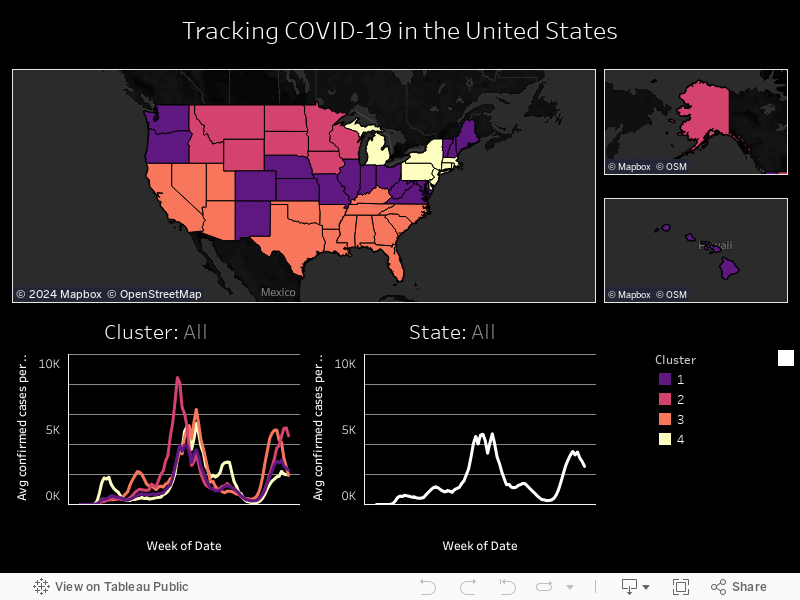
Clustering was used to group states according to similarities in these patterns. The features to be used for clustering were selected based on two assumptions: 1) that the most “interesting” features would be those dates with the highest variance in confirmed cases (i.e. some states had many cases, others had relatively few), and 2) that these dates of high variance would roughly correspond to the dates of “spikes” in cases when measuring the country as a whole. The features were selected from candidate dates, which were defined as local maxima in confirmed cases variance. From these candidates, 7 features/dates were selected graphically. After scaling and centering, 7-dimensional k-clustering was used to group states by these features. The ideal k value of 4 was selected by comparing silhouettes for values between 2 and 10.
Results:
As can be seen from the heat map below, the first spike in April 2020 was dominated by the Northeast and Michigan, the second spike in July 2020 by the Southern states, the third spike in November 2020 by the Upper Midwestern and Plains states, the fourth spike in January 2021 by the Northeastern, Southern, and Southwestern states, the fifth spike in spring 2021 by the Northeast and Michigan, the sixth spike in August 2021 by the Southern states, and the seventh spike in September 2021 by the Midwestern and Plains states.


Sources:
Data was obtained from the Johns Hopkins CSSE.